![people element logooo.png]](https://20709424.hs-sites.com/hs-fs/hubfs/people%20element%20logooo.png?height=50&name=people%20element%20logooo.png)
You have access to the user guide, data filters, save, download, report builder, and more options in the top right of your screen when viewing the dashboard page.
- The user guide provides helpful insights into each dashboard widget.
- Data filters allows you to change the data you are viewing by selecting surveys, date ranges, and demographic filters. (If orange, there is a demographic filter on)
- Use the heart icon to save your dashboard report as a favorite.
- Download the dashboard to PDF or PowerPoint and use the hide/unhide icon to find any hidden widgets and bring them back into your view.
- Utilize the report builder to create customized reports.

The following are standard dashboard components that display across all employee journey survey types.
Participation
-
Total Invited (Not available for anonymous surveys): Shows how many survey participants were invited to take the survey within the dates selected.
-
Total Responses: Shows how many survey participants responded to the survey within the dates selected.
-
Participation % is the percentage of responses out of people invited. For “always-on” surveys, participation is based on the last 12 months from the selected end date.

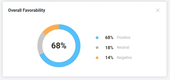
Overall Favorability: The overall percentage of favorable responses is based on single select questions only. On a 1-5 scale, favorable/positive responses are 4 and 5. View your survey's overall favorability score and see what percentage of responses fall into the neutral and negative favorability groups. For more information on scales, view our scale article here.
Favorability by Category: The percentage of favorable responses based on single select rating questions per category. Surveys are designed to group similar questions within a topic or category to provide a high-level summary of results. This widget displays if there are at least two categories included in the survey with single select rating questions.

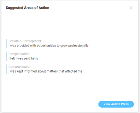
Suggested Areas of Action: Displays the top three survey items to act on. When you click on “View Action Plans”, you are guided to suggested actions using our best practice recommendations.
These areas of action are determined by a proprietary algorithm that considers several key factors. It uses quartiles to assess how items perform compared to the median, checks for negative differences from company benchmarks, and tracks changes in past scores. The algorithm ranks items based on all these factors and their average scores. This detailed approach ensures the results are accurate and takes into account both past performance and current goals.
From here, you can create and save action plans for any single select question within the survey.
Highest and Lowest Rated Items: Displays questions with the highest and lowest favorability scores. This widget displays for surveys with more than 1 single select question. If questions have the same favorability score, the order is based on the mean score.

Top Drivers of Engagement (Engagement Surveys Only): These are the specific drivers of engagement based on your survey results. This advanced analysis known as a key driver analysis identifies the questions that have the most impact on engagement. In short, if you focus your actions on the key drivers questions, you are more likely to improve engagement.

Dashboard Key Metrics
In addition to the standard survey dashboard insights, key engagement and retention metrics may display based on specific survey types like engagement, new hire and exit, which can be used to drive organizational outcomes when addressed.
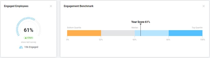
Engaged Employees (Engagement Surveys Only)
Engagement surveys identify the percentage of people engaged based on their responses to the engagement index questions built into the survey. We use an engagement index to measure the true sentiment of your employee's engagement.
The gauge in the Engaged Employees widget shows a measure of your engagement score from 0% to 100%. The green or red bubble indicates an increase or decrease in engagement percentage points since your last engagement survey. The last engagement survey is determined by the most recent end date of an engagement template survey. The blue people icon shows the number of people who are engaged.
Engagement Benchmark (Engagement Surveys Only)
We want to make it easy to understand how your employee engagement levels compare to other organizations. Our benchmark uses real employee data, not data collected by market research providers. We use all customer engagement data for the previous year to create percentiles to show where your engagement score falls within the global benchmark.
The median engagement score, or 50th percentile, is based on 60% engaged employees. If you have an engagement score of 60% this means your score is higher than 50% of other companies.
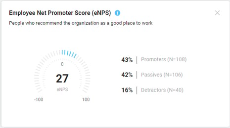
Employee Net Promoter Score (eNPS)
eNPS is a metric used to measure employee loyalty and engagement within an organization. An eNPS score is calculated by subtracting the percentage of detractors from the percentage of promoters. Scores range from –100 to +100, and you will see this represented on the gauge with a positive score shown as blue tick marks to the right of center, and a negative score shown as orange tick marks to the left of the center. While the eNPS is calculated from percentages, it is important to note that an eNPS is a score, not a percentage. To learn more about eNPS and how promoters and detractors are calculated, review this article.
Likely to Stay
This turnover prediction metric tracks the likelihood of employees to stay with the organization. This metric is based on the percentage of people who respond favorably to the question asking if employees plan to stay at least one year. Monitor changes in conjunction with opportunity areas to guide action and intervention early in the new hire journey. Having this data point helps pin-point potential barriers to address before new hires decide to leave.
Likely to Return (Exit Surveys Only)
Based on the likelihood of an employee's willingness to come back and rejoin the company in the future. If an exited employee indicates they would be likely to return to the organization, they are identified as someone with “ rehire potential” and included in the percentage of people identified in this metric. See The Untapped Potential of Boomerang Employees for more insight.

Turnover (Exit Surveys Only)
Turnover refers to the number of employees who have exited or left the organization in a designated period of time. It is the measure of the movement of employees out of an organization.
Turnover is calculated by the number of termination dates that occur over a given period. An employee’s termination date is captured once they’re assigned to an exit survey. The turnover calculation only includes individuals assigned to the selected exit survey. If a participant is manually unassigned from the exit survey, this participant is no longer included in the termination calculation. If the exit survey is an anonymous survey, the turnover chart will not display as there are no termination dates associated with participants in an anonymous survey.
- Total: the total number of exits, or termination dates, for the months displayed on the chart.
- Month avg: the average number of exits per month. This is calculated by the total number of exits divided by the number of months displayed on the chart.
Projected Turnover (New Hire, Stay, and Onboarding Surveys Only)

The projected turnover chart represents the number of people who indicate they are likely to leave the organization in response to the survey question “I plan to work here for at least 1 year from now”. It is calculated by totaling the number of unfavorable responses to the question “I plan to work here for at least 1 year from now”. Unfavorable responses are assessed differently depending on the question scale, for example, on a 5-point scale a response of 1 or 2 is unfavorable. Those who are likely to leave are displayed in the month they provided feedback.
- Total: the total number of people likely to leave for the months displayed on the chart.
- Month avg: the average number of people likely to leave per month. This is calculated by the total number of people likely to leave divided by the number of months displayed on the chart.