![people element logooo.png]](https://20709424.hs-sites.com/hs-fs/hubfs/people%20element%20logooo.png?height=50&name=people%20element%20logooo.png)
View responses to your yes/no survey questions here. This will only display if you have yes/no questions included in your survey.
-
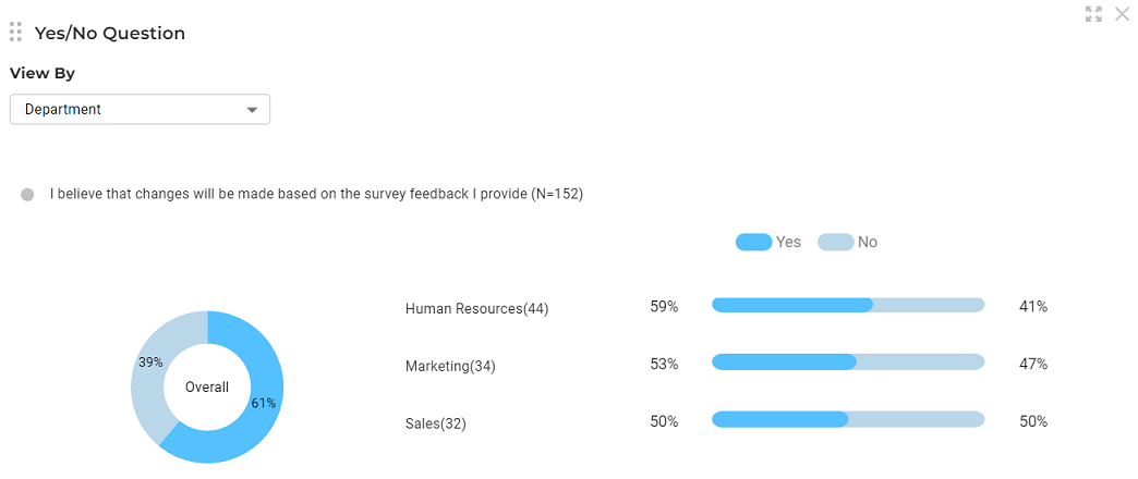
The question displays first along with the number of responses (N) to that question.
-
The pie chart displays the overall percentage of responses that were “yes” and “no”.
-
Hover over the chart to view data labels.
-
Utilize the view by dropdown menu to switch between demographics or select no demographic breakout.
-
The percent of “yes” is shown in dark blue and the percent of “no” is shown in light blue.